During this unit, I learned the psychological effect on people through adverts and how media is being presented. This is important if you want to produce a very powerful advert and attract the viewers’ attention.
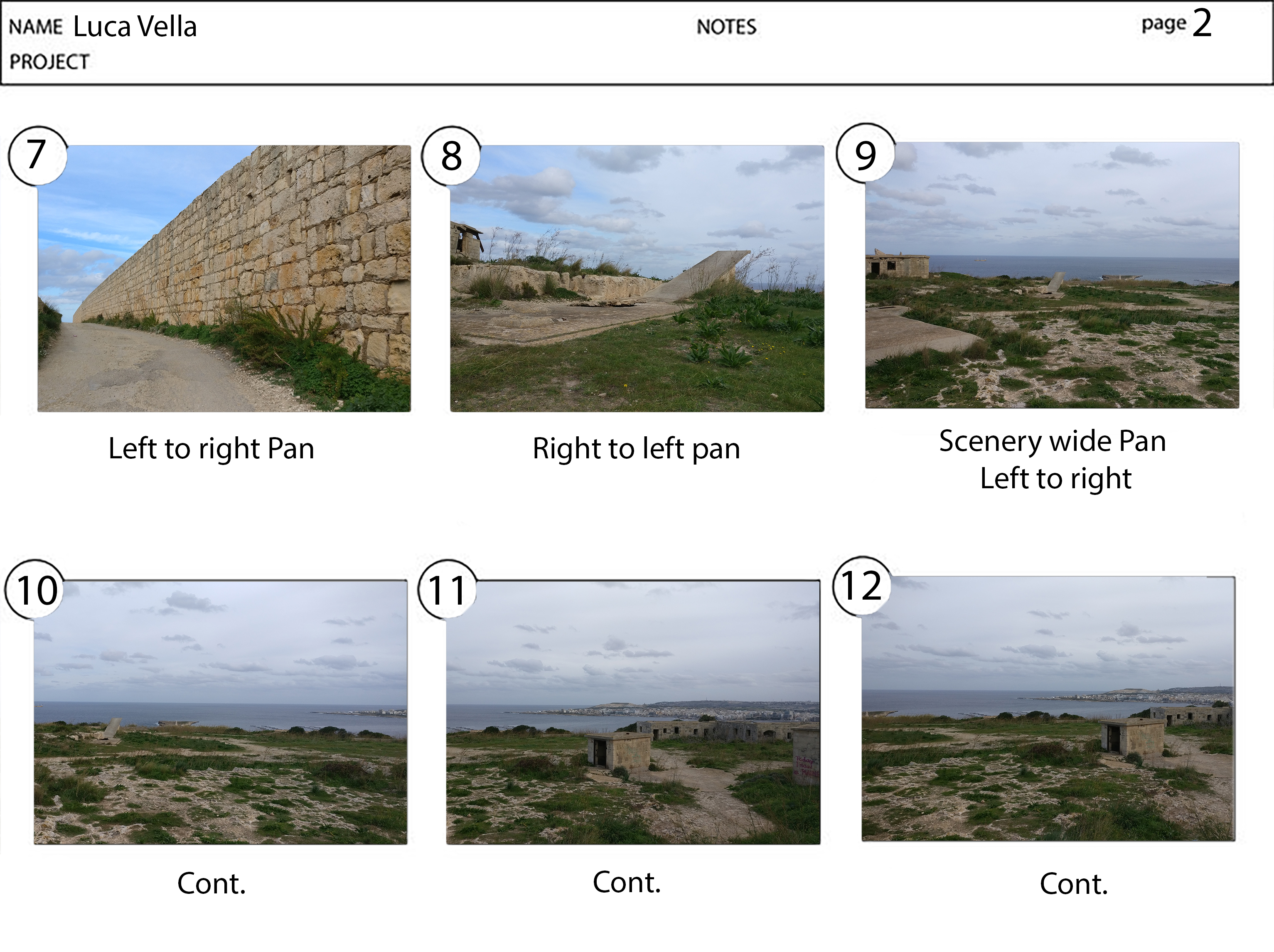
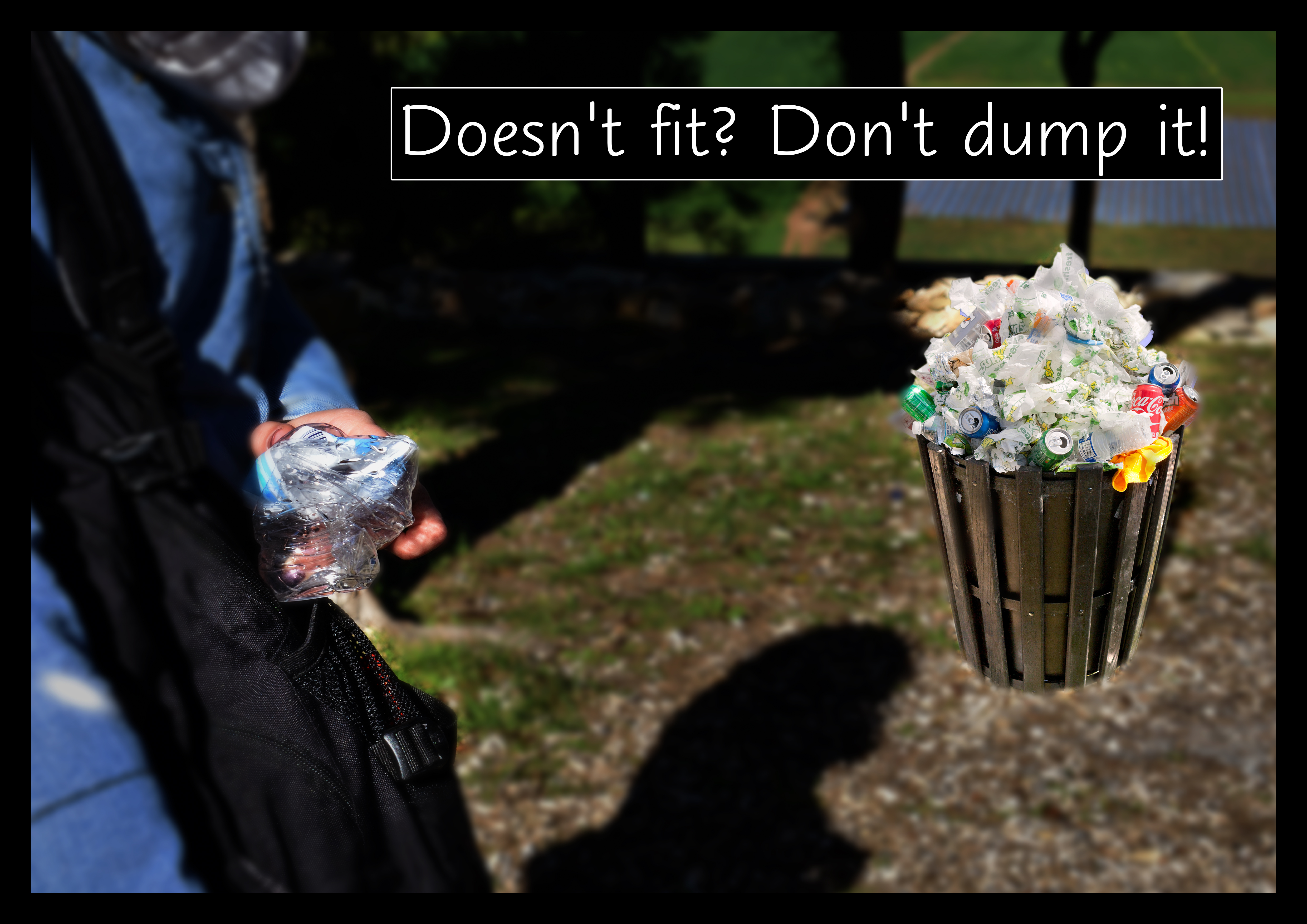
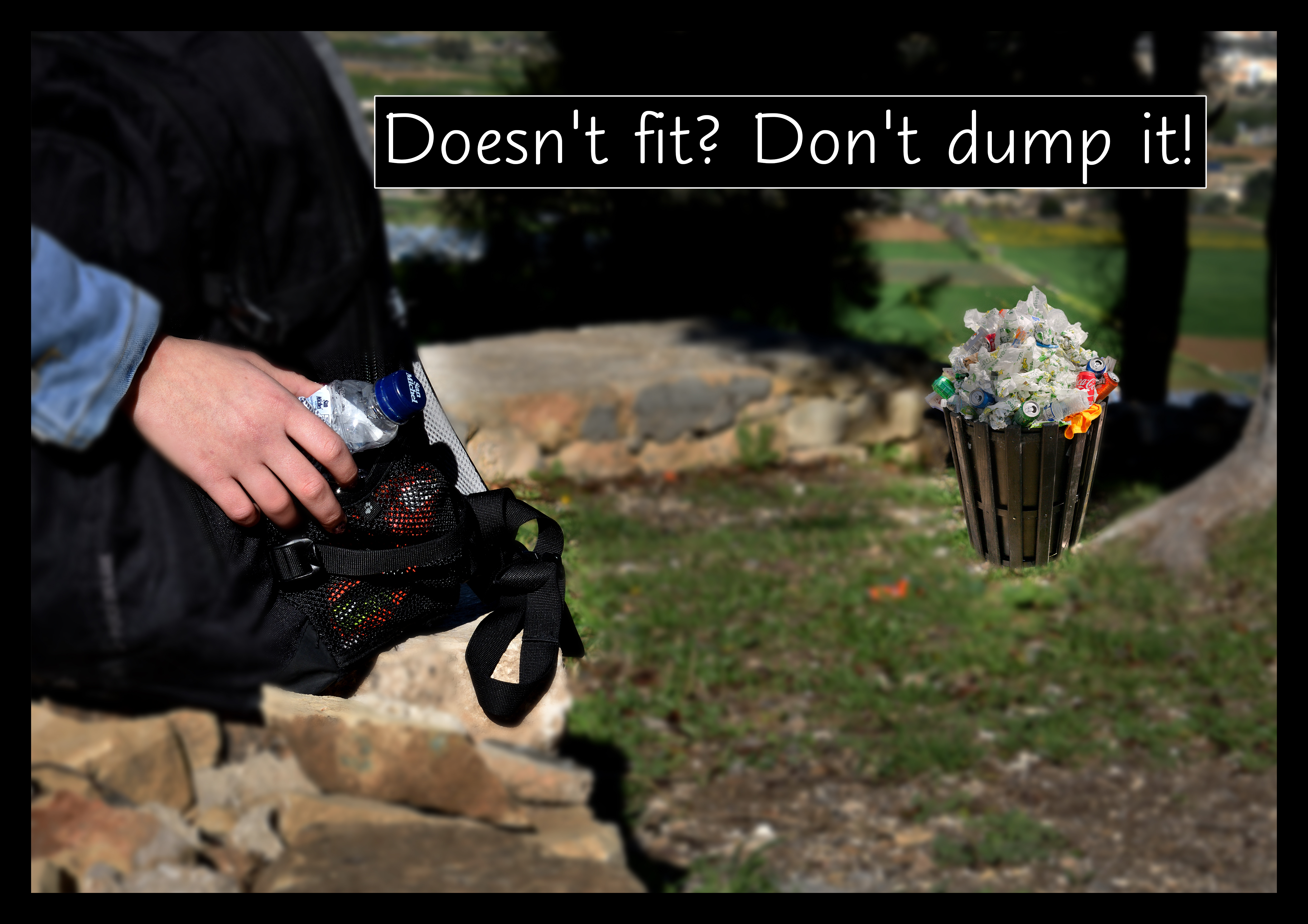
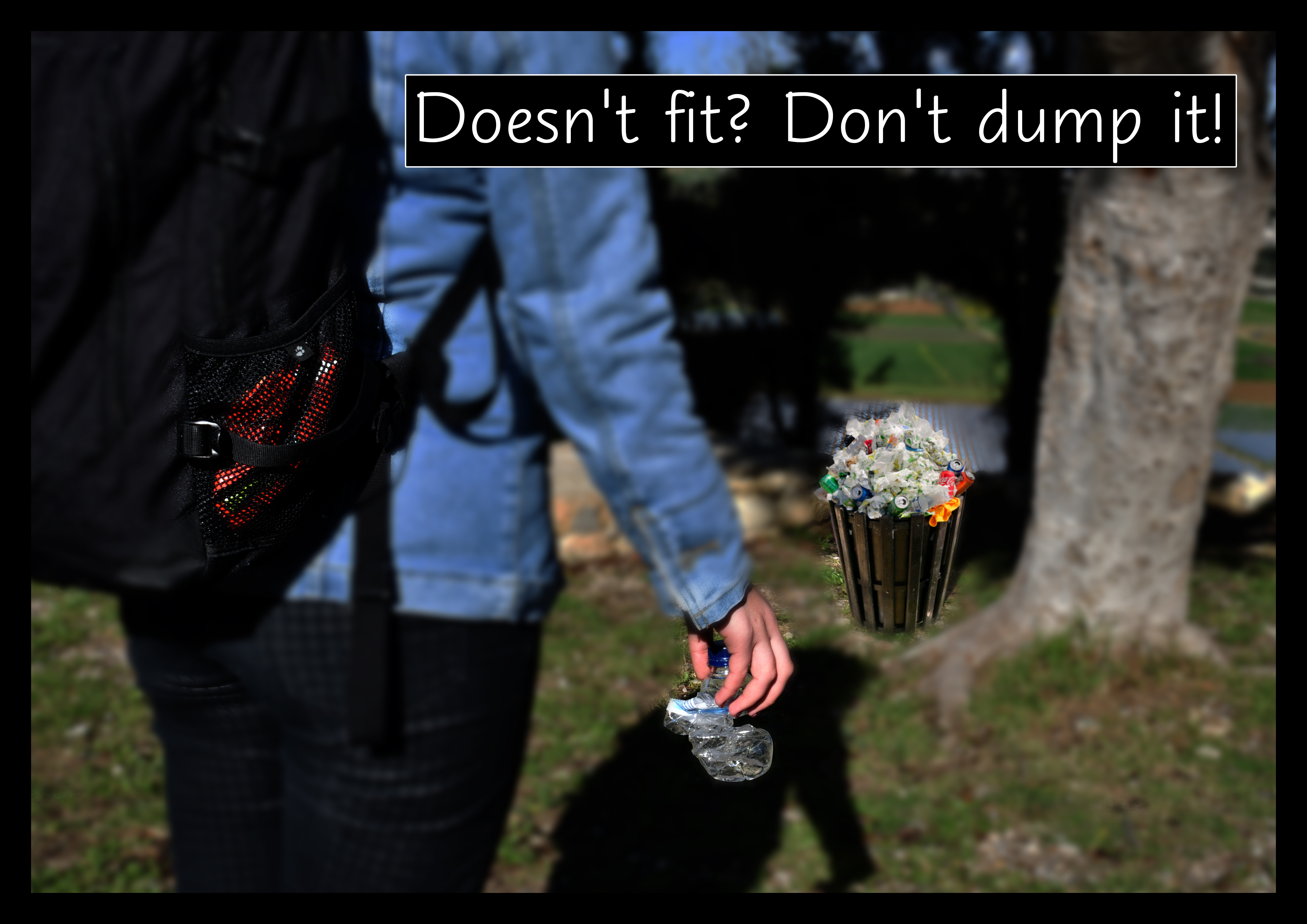
The project I presented was about the full trashcans and what we, as a community, can do to prevent this. The feedback given was helpful and had there been more time I would have tried to further improve and strengthen the images. Adding more rubbish on the floor surrounding the trash helps to further suggest the message being conveyed. Had the photos been edited to have the trash cans in colour while the rest of the image in black and white instead of the blur effect could have further highlighted the message behind the set of photographs presented.
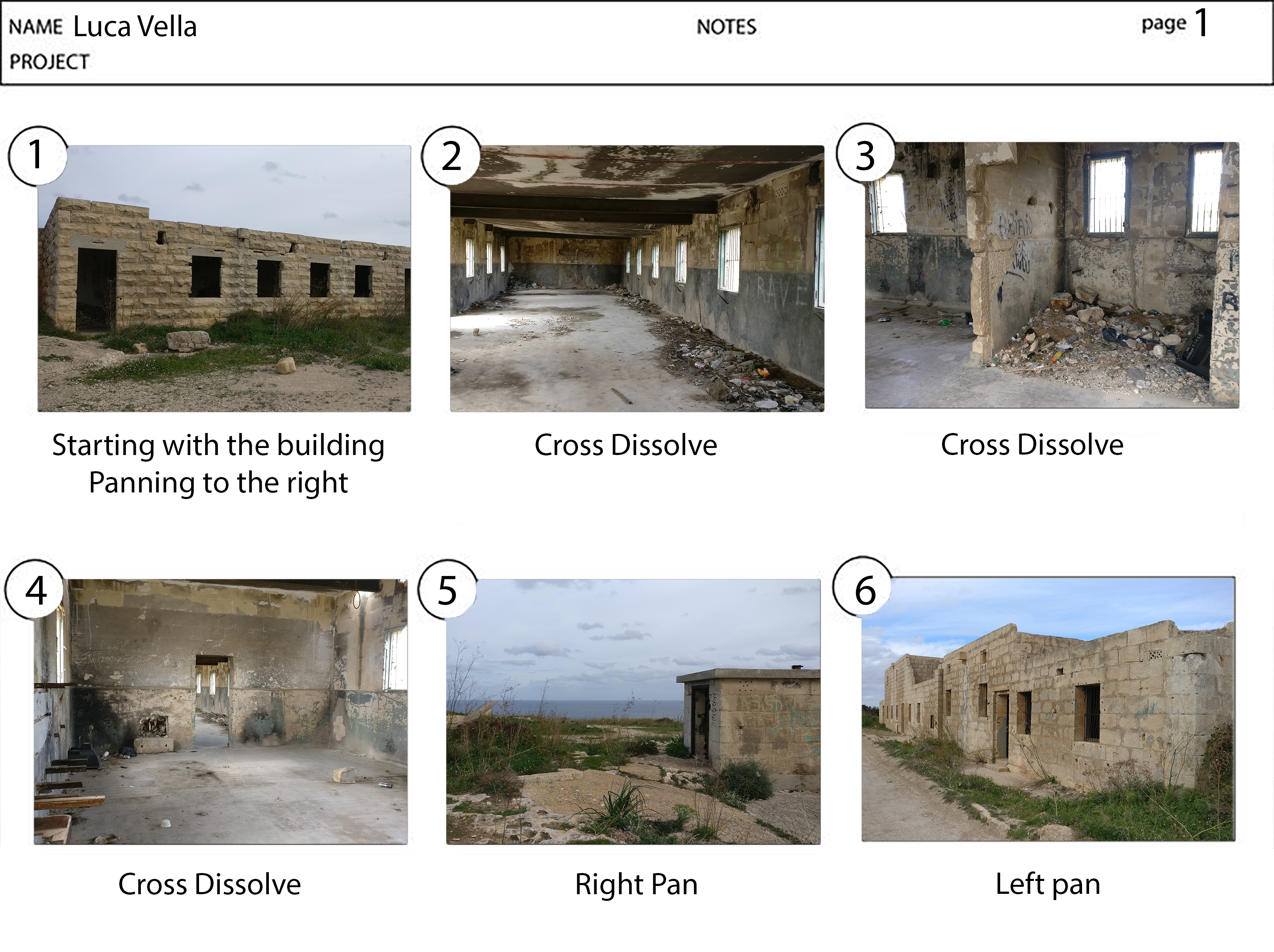
The images produced were quite similar, an oversight on my part when planning as shooting in different locations would have produced a more effective campaign.
It is a clear message however not that obvious to many people. Moreover, the research that was carried out at the beginning of the assignment helped to create an effective idea.
The progress during the unit was slow but steady always busy focusing on a small part of the project at a time. I find that the process used where the larger picture was divided into smaller tasks was effective in order to have an overall smooth experience.
Task 1 was the base of this unit, finding your passion in line with the social issues. The issue which I chose to focus on is one which I try to carry out on a regular basis whenever I can’t find a trashcan or it is already full. Therefore this unit helped me to explore the unknown uncanny to get the message through to the viewer.
Digital media, in the new world everything is digital from newspapers to how we consume video from youtube to Netflix and tv shows. This unit showed me how important editors and people in the media industry are with the first task of research.
Task 2 was the hardest for me as I find it quite hard ta design and it doesn’t come as natural to me as editing and mixing sound. I tried really hard and did my research but I still found it hard. I tend to create systematically that’s where my OCD kicks in that I need to used the round numbers and it has to be symmetrical. This is what I created in my newspaper.
As for my showreel, it’s intended to be future proof, since the edit is systematical and to show the project how it is intended to be used rather than in a showreel. Overall I also hate research but this opened my eyes that it’s important in production as without having carried out good research before hand the end result won’t be up to the standard required.
Everything in this unit was visual the way I like it but this had a set back to me as I was trying to create the horizontal lines form the images but I didn’t see it fit.
Tips given by both lecturers were very useful even when using rectangles to measure it digitally.
Overall a very good learning experience and one which I intend to put into practise while producing future works.
As a whole, the video turned out very well. However, there were some features which were missing, such include the title of the project. Another aspect which could have been improved in order to reinforce the uncanny feel was the track. The main positive feature is that it is easy on the eyes rather than being too complicated to understand, this helps in order to get the message through to the audience in an efficient manner.
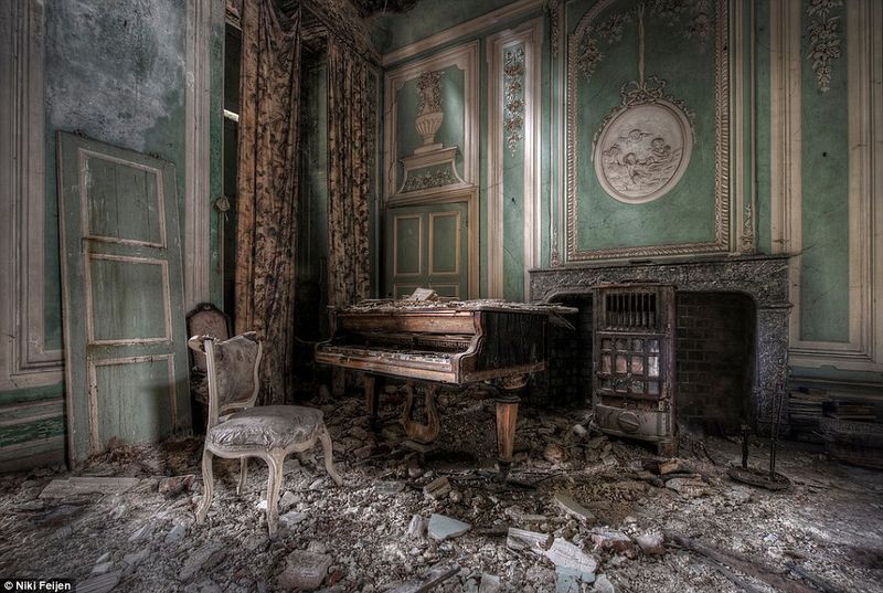
The visual aspect, that is; making good use of lines, patterns and different textures enhance the uncanny feel of the place while viewing the trailer. Personally, I believe that this unit has given me a different perspective on what makes the visuals of a project efficient. Throughout this unit, I feel that specific features, which previously I did not know how to create and interpret and therefore dismissed, are more significant to the audience than I would have already thought. An example of this could include the negative space in a frame, which I would have previously thought to be empty space. However, now I understand that this area can be more than emptiness as it can be used in a creative manner to further convey the intention of the video.
The name given to this unit is highly suitable for the information that is taught as it is the understanding of how we humans visually interpret certain things and have a negative-positive emotional response to what type of technique is being used to portray the meaning behind the image or video.
When learning how different aspects and features help convey the message behind visuals, it can be quite challenging. This is because trying to learn and understand things which depend on interpretation are not as simple as they seem, as one image can have various definitions which vary between one person and another. This is the primary reason behind having different styles and different ways to portray a single emotion in visual rather than having a one size fits all situation. However, knowing which methods best suit the message can also create a dilemma between people as one might prefer focusing on one feature while others might prefer another.
As with the majority of units, however, in particular with visual thinking, research was vital in order to get a better view on how different people use the techniques we were learning and also appreciating the effect that is being produced. From this research one could further understand how different opinions coming from different people result in different media being applied to various images and videos in order to convey the idea. An example can include Andrew Webb and how he describes Malta through his picture, however keeping in mind that this is only one opinion. Also it could be that one might be proud of his country and thus failing to see eye to eye on the matter.
Within the video I have produced I tried to convey these various effects, moreover different people would find them to be more or less effective depending on personality, culture as well as other aspects related to media they are exposed to on a daily basis.
Since this task was peer reviewed I felt that a better form of feedback was received rather than when getting an opinion from a single lecturer. Firstly because two opinions were given rather than having a single opinion, hence having my work viewed from different perspectives. Secondly whilst reviewing other people’s works I felt that I could further improve my personal skills by learning from their mistakes as well as from their merits.
The right approach for further development is to research more on film noir and go into more depth on how to creatively use the available frame you have in a video or photo. This can be fundamental in journalism and news related aspects of media where the viewer is influenced by the writer or the one investigating. Also had I paid more attention to detail in my edit, I think it would have turned out much better regarding the aspect in the frame and how I portrayed the uncanny trough my medium.
The biggest difficulty for me while working on the task was to cut down the four-minute track down to thirty seconds, with creating an awkward audio for the audience. Had the trailer been required to be forty-five seconds instead this problem would have been much easier to get through. Overall I also think that had it been fifteen seconds longer it would have been easier to convey the message since the topic is quite complex.
In conclusion, I think this unit is interesting as it gives you a new perspective on how to look at media especially with regards to how various feature can all contribute to conveying one main message.
The project’s aim is to bring awareness to the viewer, how to reduce messes in public spaces and how to act on it. If you see a full trash can don’t try to fit it in but rather put it in your bag pocket etc and throw it away later when you encounter another trash can or arrive at home. These series of images portray that exactly and clearly. Since we are a long way from digital trashcans everywhere to tell the local council when the trash is full to come pick it up, this is a short-term solution to teach our kids and future generations.
Overall this trailer is a well put together idea. The music chosen was a right fit for the style of editing used. It makes use of good camera techniques in conjunction with the right editing. The only thing that bothered me is the uneven camera pans in multiple shots.
The uncanny in this trailer reflects the discrimination depending on the different ways we dress and look. Where just because a person dresses differently to what society is used to they can be treated as if they are not normal. The message behind the trailer is established in the first shot.
The location chosen was a good choice however I feel that it was misused. It lacked shots of the old stone on the sides and more atmosphere of the surrounding people in order to provide a better background, rather than an empty shot of the feet.
The first shot is good with a pan of the location, moreover I think that the title is an eyesore giving the shot a negative feel to the scene rather than enhancing it. I think that instead of having a very long pan in an upcoming shot this time could have been used to give the title more importance rather than just placed on the screen.
The second shot was a good reaction shot with the blurred background. I find the next shot to be a boring and long intro, it could have been made shorter. Which in turn would have given you time for the intro as mentioned earlier.
The shot showing the girl’s feet was somewhat confusing with regards to what was the message behind it. Since it was quite a long shot it might have been trying convey a certain aspect which unfortunately did not get through to the audience. However if it was to emphasise further on the different clothing that is worn by the rest of society it could have been shorter.
Personally I found the last shot to be most effective as it was framed beautifully and made the best use of low aperture. The movement of the protagonist with the focus and it’s connection to the environment to me produced a good shot.
I think that the shots are all compatible with the theme but the misuse of editing is what is letting this trailer down. Overall the is consistent filming being around sunset, Negative space is well used and not disregard.
Although all the shots are compatible to the theme given I think that the editing effected the trailer negatively. Overall the filming was consistent being that is was around sunset. In addition the negative space was well used and not disregarded.
Instead of making use of cuts, I feel that cross dissolves would have been a better way to transition between shots as it would have further emphasised the uncanny behind the trailer.
Although this might have been caused when uploading to youtube, one could note the thick black border which can be off-putting. Besides the border, I also found the sound to be too quiet and in order to have it complement the video correctly I put up the volume almost to a maximum.
Since this is only the trailer I am not in a position to comment about the perception of the story but rather how I think it’s going to resolve. I think that the protagonist is going to go through some disturbing events that suggest society around her is hating her.
Being that what we saw was a thirty second trailer rather than commenting on perception I feel I can comment on how I think it is going to resolve. I believe that the central character shown in the trailer goes through disturbing events suggesting that the society around her show hatred towards her possibly because she is not what the society feels is normal for a person.
In conclusion it was a well-presented trailer, with a good idea, good shots, however the editing could have been given some more thought in order to bring the whole idea together as a whole.
The trailer was well put together containing the right tempo, mystery and unknown. The music chosen was a right fit and how the music came in with the heartbeat is a good idea. Making good use of camera techniques in conjunction with the right editing. However the only thing that bothered me is the camera shake of the first shot.
The Uncanny in this trailer is the darkness and the unknown the paranormal. That was clearly marked in the video and even without the title at the end, it would have been clear in regards to context.
One way in which the message behind the trailer is being conveyed is the use of natural light together with the framing. This provides an indication that research was done beforehand in order to find different ways to portray the message.
In the first shot, a silhouette is seen indicating that there is an unknown. The protagonist is a dynamic shape and the surrounding area is a static shape indicating that the “story ” is going to be about her or something revolving around her. The second shot Leading lines to the unknown at the end of the corridor. Same silhouette style from the previous shot. The next two shots are quite bright producing a contrast conveying the feeling of a brief hope that everything is going to be ok however this is proved to end quickly in the next shot. The last shot is that of a dark one taking the audience back to the paranormal theme that is being presented presented. The final shot is the title that screams at you, indicating that your initial assumptions were in fact right.
The movement isn’t one that’s smooth and natural but rather jerky, questionable and weird then again going on with the same overall theme. Overall the colour of this trailer is that of cool and dark. Negative space is well used and not disregard, the darkness the feel of emptiness is all that brings the edit together.
Rather than using cuts, cross dissolves where used in order to transition from one shot to another and this was another feature that gave it a sense of greater mystery.
The title makes use of font, colour, size and placement in the frame which greatly complement the feeling that is being conveyed in the title.
The location was not chosen at random however with the intention to give the story texture. This texture could be noticed on the walls and also on the floor.
Since this is only the trailer I am not in a position to comment about the perception of the story but rather how I think it’s going to resolve. I think that the protagonist is going to go through some disturbing events that suggest that she’s having paranormal anomalies.
Well done a well-presented trailer with the right idea in mind and the work produced reflects the message that is being delivered to the audience.
Basically, it’s easy an image with the dumpster full to the brim with garbage and this person just seeing their hand in the shot of putting the trash in their bag.
Project plan
My project
To deliver to all audiences how to not litter when the public trash is full as we see in our country. The message is to take it home with you and throw it away then.
Equipment: Nikon camera with 32gb SD card and lens
Budget: €20 to build a fake full trashcan.
Locations: Mosta gharusa Gardens
Model: Booked for the 10th of January
Production Schedule :
22nd December until 3 January to produce backup trashcan.
10th January to take the image with the model
11th to 15th January editing of the image.
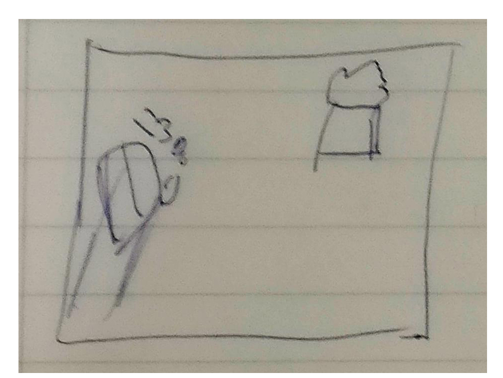
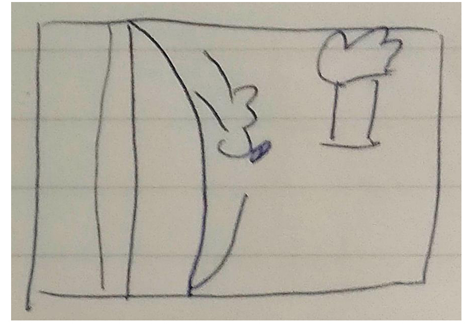
Shot list: 4 shots of the model.
Story Board:
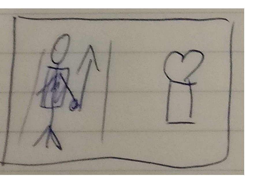
Person waling past the trash can holding the trash in their hand
On a bench eating and throwing away trash in their bag.
Cu of putting trash in bag and trashcan full in background
Examine and understand the messages that images contain
How these messages are communicated AD received by the audience
how these messages persuade the audience
the extent to which they take apart in ce=reating and ideological worldview.
3 Messages
the linguistic message – refers to the text that clarifies ambiguity in images
the symbolic message (Connoted) – is the pure image aside from linguistics that offers symbols (signifiers) that relate to or reveal some sort of concept (signified)
the literal message ( denoted) – is what is left when we remover the linguistics
Anchorage and Relay
Anchorage
Focus not simply my gaze but also my understanding –
identification but also an interpretation
The function of Anchorage is to clarify or emphasize something in the image
Relay Expand, suggests something beyond the connotations already available in the image.
There isn’t a publication where publically admits to using InDesign publically but rather internally. The only relevant article I could find the following, a comparison between Photoshop and InDesign when creating a print design.
Mis -en -scene
Desgin aspects of a film
“visual theme / “telling a story”
when applied to cinema it refers to vething that appears before the camera
Compostion : prps, actors, costumes, seets, lighting
– position ing , movement, visual allignment
I was scrolling through social media a few years back and this quote by Lady Gaga –
“If you dont have any shadows you’re not in the light”
? Lady Gaga
After I read the brief, I was sure on what topic I will the use of HDR or the most significant difference in the whites compared to the blacks of the image. This is where I hopped on to google and searched what I have been done before what I found is the following link actually useful when taking the images and editing them.
What I wanted to convey is the shadows and how they hit structure or various objects found on the street to create a more exciting image. While framing the shot the angle from where to take the picture took a big part of the work rather than mounting and setting exposure and the other technical jargon. When choosing the edge knowing were the sun is the most important for this type of imagery and placing yourself 90 degrees from the light (sun) to get more harsh and beautiful photo.
For the images, I wanted to create a shallow depth of field to introduce mystery in the picture. Once the photos were taken these were imported into Lightroom for simple touchups to make the desired output with the levels. The right Black, White, Shadow and highlight level was created then just exported in Jpeg full quality.
When I choose an image it’s either I like or I don’t in its raw form rather than picking out the needle from the haystack. After the image has been chosen the right set of colours and other post-processing is done but less is more.
References
Street Photography with High Dynamic Range
Graphics.com. (2017). Street Photography with High Dynamic Range. [online] Available at: http://www.graphics.com/article-old/street-photography-high-dynamic-range [Accessed 5 Nov. 2017].
Quotes About Shadows (217 quotes)
Goodreads.com. (2017). Quotes About Shadows (217 quotes) . [online] Available at: https://www.goodreads.com/quotes/tag/shadows [Accessed 1 Nov. 2017].
Mis -en -scene
Design aspects of a film
“visual theme / “telling a story.”
when applied to the cinema it refers to everything that appears before the camera
Composition: props, actors, costumes, sets, lighting
– Positioning, movement, visual alignment
 .
.