As a whole, the video turned out very well. However, there were some features which were missing, such include the title of the project. Another aspect which could have been improved in order to reinforce the uncanny feel was the track. The main positive feature is that it is easy on the eyes rather than being too complicated to understand, this helps in order to get the message through to the audience in an efficient manner.
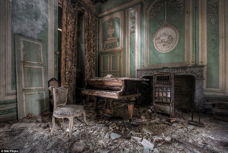
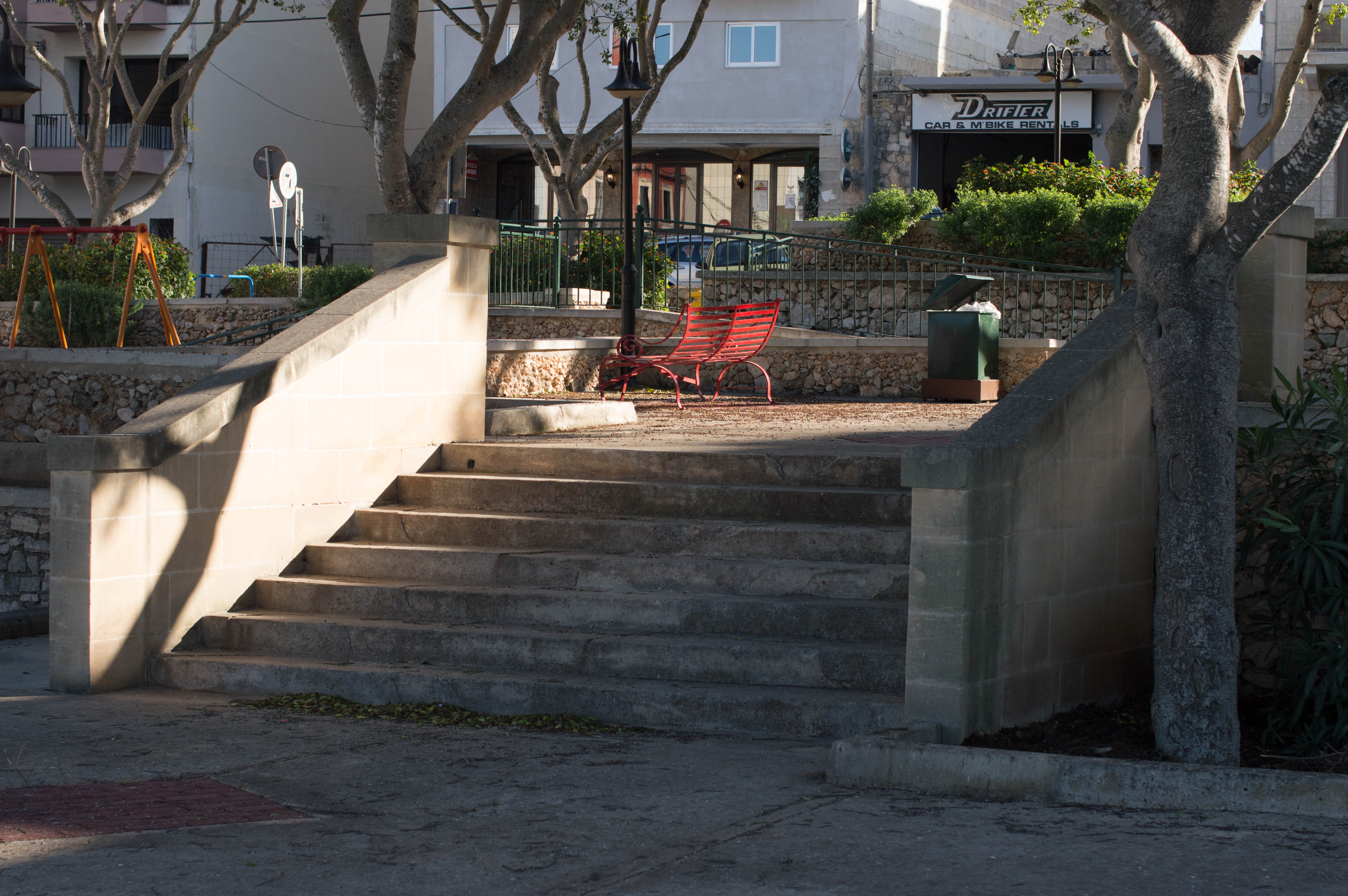
The visual aspect, that is; making good use of lines, patterns and different textures enhance the uncanny feel of the place while viewing the trailer. Personally, I believe that this unit has given me a different perspective on what makes the visuals of a project efficient. Throughout this unit, I feel that specific features, which previously I did not know how to create and interpret and therefore dismissed, are more significant to the audience than I would have already thought. An example of this could include the negative space in a frame, which I would have previously thought to be empty space. However, now I understand that this area can be more than emptiness as it can be used in a creative manner to further convey the intention of the video.
The name given to this unit is highly suitable for the information that is taught as it is the understanding of how we humans visually interpret certain things and have a negative-positive emotional response to what type of technique is being used to portray the meaning behind the image or video.
When learning how different aspects and features help convey the message behind visuals, it can be quite challenging. This is because trying to learn and understand things which depend on interpretation are not as simple as they seem, as one image can have various definitions which vary between one person and another. This is the primary reason behind having different styles and different ways to portray a single emotion in visual rather than having a one size fits all situation. However, knowing which methods best suit the message can also create a dilemma between people as one might prefer focusing on one feature while others might prefer another.
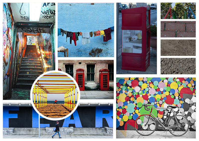
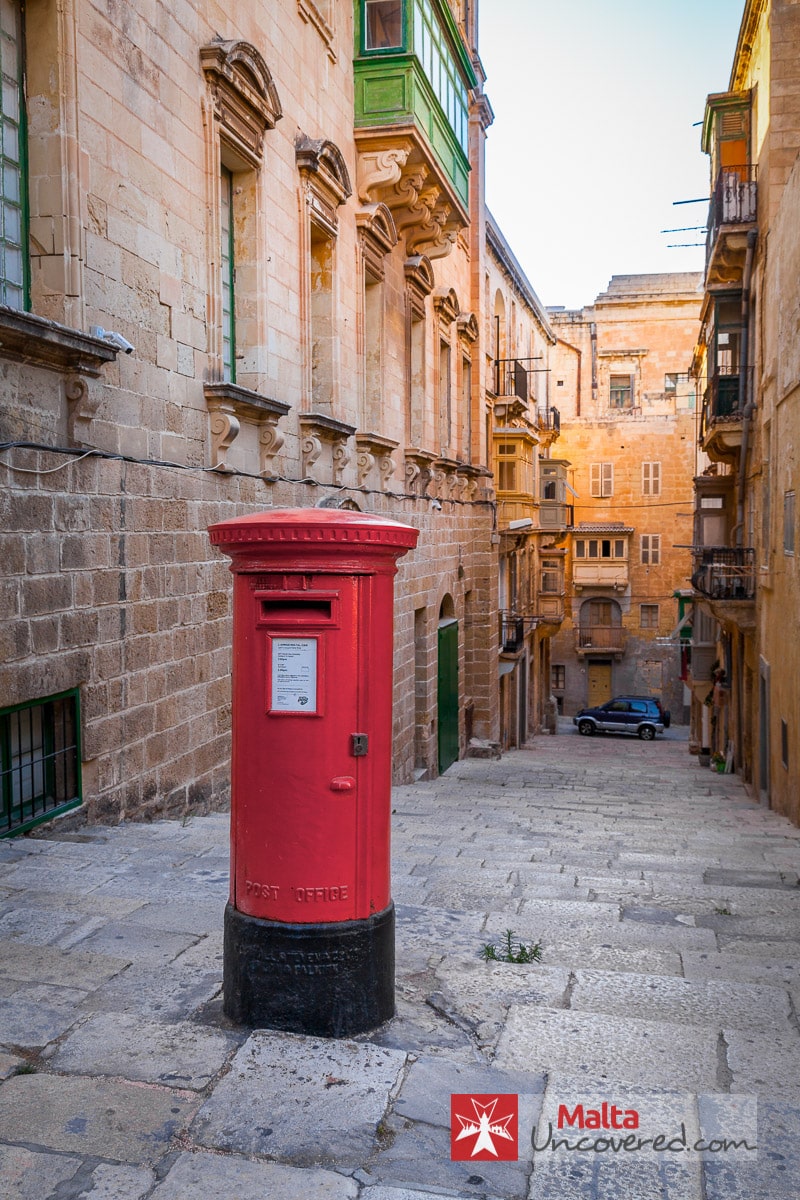
As with the majority of units, however, in particular with visual thinking, research was vital in order to get a better view on how different people use the techniques we were learning and also appreciating the effect that is being produced. From this research one could further understand how different opinions coming from different people result in different media being applied to various images and videos in order to convey the idea. An example can include Andrew Webb and how he describes Malta through his picture, however keeping in mind that this is only one opinion. Also it could be that one might be proud of his country and thus failing to see eye to eye on the matter.
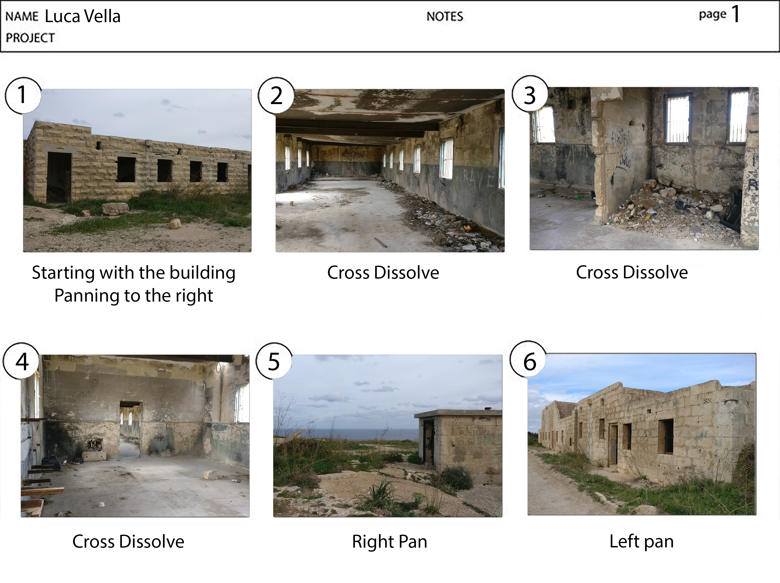
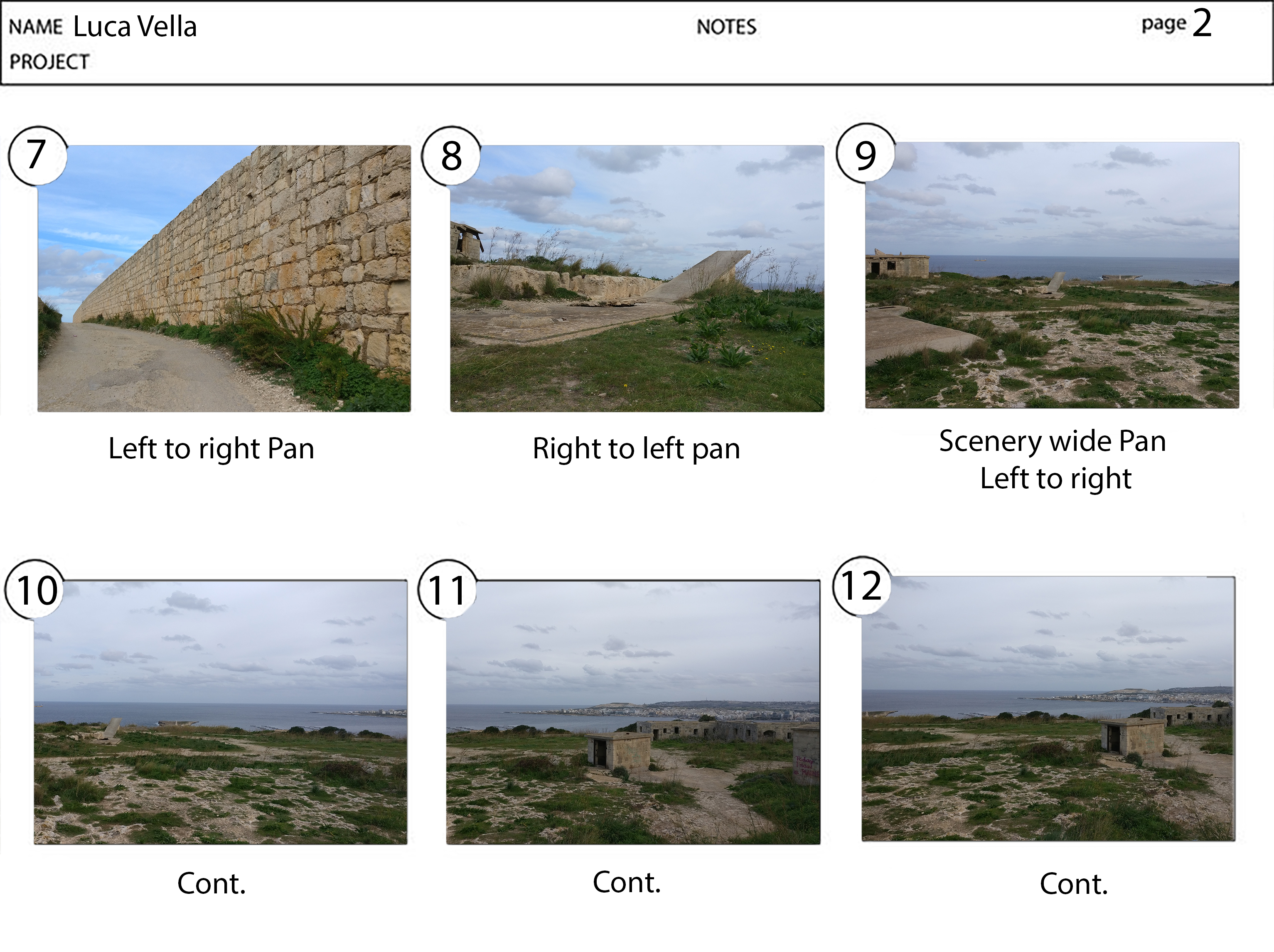
Within the video I have produced I tried to convey these various effects, moreover different people would find them to be more or less effective depending on personality, culture as well as other aspects related to media they are exposed to on a daily basis.
Since this task was peer reviewed I felt that a better form of feedback was received rather than when getting an opinion from a single lecturer. Firstly because two opinions were given rather than having a single opinion, hence having my work viewed from different perspectives. Secondly whilst reviewing other people’s works I felt that I could further improve my personal skills by learning from their mistakes as well as from their merits.
The right approach for further development is to research more on film noir and go into more depth on how to creatively use the available frame you have in a video or photo. This can be fundamental in journalism and news related aspects of media where the viewer is influenced by the writer or the one investigating. Also had I paid more attention to detail in my edit, I think it would have turned out much better regarding the aspect in the frame and how I portrayed the uncanny trough my medium.
The biggest difficulty for me while working on the task was to cut down the four-minute track down to thirty seconds, with creating an awkward audio for the audience. Had the trailer been required to be forty-five seconds instead this problem would have been much easier to get through. Overall I also think that had it been fifteen seconds longer it would have been easier to convey the message since the topic is quite complex.
In conclusion, I think this unit is interesting as it gives you a new perspective on how to look at media especially with regards to how various feature can all contribute to conveying one main message.
 .
. 


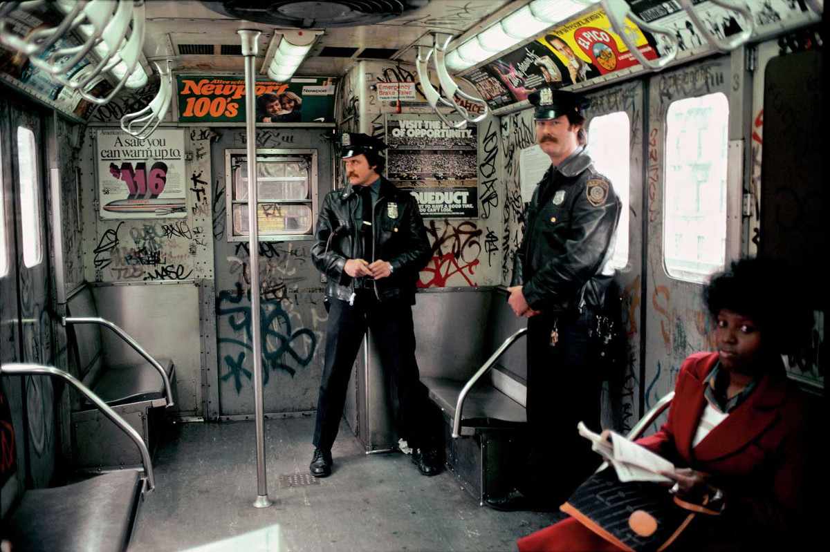
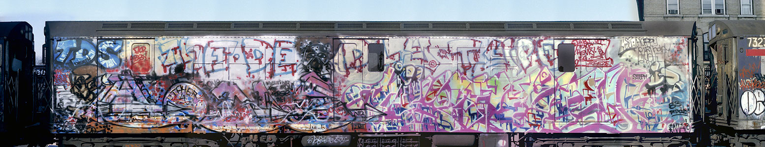
. henry chalfant - Google Search. [online] Available at: https://www.google.com.mt/search?rlz=1C1GGRV_enMT752MT752&q=henry+chalfant&spell=1&sa=X&ved=0ahUKEwjB9Or88ZLXAhVBJFAKHbhoCOMQBQgkKAA&biw=1920&bih=949 [Accessed 28 Oct. 2017].Henrychalfant.com. (2017). Henry Chalfant. [online] Available at: http://www.henrychalfant.com/#filter=.home [Accessed 28 Oct. 2017].Maltauncovered.com. (2017). Cite a Website - Cite This For Me. [online] Available at: https://www.maltauncovered.com/wp-content/uploads/valletta-street.jpg [Accessed 28 Oct. 2017].Openwallsgallery.com. (2017). Cite a Website - Cite This For Me. [online] Available at: https://openwallsgallery.com/street-art-photography/ [Accessed 28 Oct. 2017].Openwallsgallery.com. (2017). Cite a Website - Cite This For Me. [online] Available at: https://openwallsgallery.com/artwork/jordan-seiler-republika/ [Accessed 28 Oct. 2017].Remax-malta.com. (2017). Cite a Website - Cite This For Me. [online] Available at: http://www.remax-malta.com/Sites/REMAXMalta/RegionalWeb/Images/Towns/st-julians-bay-street.jpg)
